The Problem with Linear Thinking
Most climate-economic models make a dangerous assumption: that the relationship between warming and economic damage is roughly proportional. Double the warming, double the damage. This intuition feels reasonable, but it’s wrong — and the error compounds in exactly the direction that makes us too comfortable.
The evidence is hiding in plain sight. The Network for Greening the Financial System (NGFS) climate scenarios — used by central banks worldwide for mandatory stress testing — rely on quadratic damage functions where 4°C of warming produces exactly 4× the damage of 2°C, a proportionality that breaks down precisely in the high-warming range where accuracy matters most. And Nordhaus’s DICE model, the foundation of most integrated assessment work, was calibrated with the assumption that 87% of GDP comes from sectors “insensitive” to weather — effectively treating the modern economy as if it operates indoors.
The real world is nonlinear. Ice sheets don’t melt gradually — they cross thresholds and collapse. Coral reefs don’t fade — they bleach en masse when temperature exceeds a critical bound. Insurance markets don’t shrink smoothly — they enter death spirals where withdrawal begets withdrawal. And financial contagion doesn’t spread in proportion to the initial shock — it cascades through interconnected balance sheets in ways that amplify exponentially.
Traditional DSGE models miss this entirely. Dynamic Stochastic General Equilibrium (DSGE) models — the workhorses of central bank climate stress testing — assume representative agents, log-linear approximations, and normally distributed shocks. They cannot represent tipping points (binary, irreversible), fat-tailed disaster distributions (Pareto, not Gaussian), or the endogenous feedback loops where one agent’s failure causes another’s. The result is a systematic underestimation of tail risk that grows worse precisely when accuracy matters most: under high-warming scenarios. A 2023 study by the Centre for Economic Policy Research (CEPR) confirmed that current climate stress test methods significantly underestimate potential financial sector losses, and the Institute for New Economic Thinking (INET) concluded the E-DSGE framework is structurally unfit for climate analysis because its interconnected linear assumptions cannot be fixed piecemeal.
We rebuilt our Climate-Finance Agent-Based Model from the ground up with 14 distinct nonlinear mechanisms — from convex damage functions and fat-tailed shock distributions to endogenous bank failure and insurance death spirals. The result: a model that captures the explosive divergence between low-warming and high-warming futures that linear models systematically understate.
Key Concepts
Nonlinearity means output does not scale proportionally with input. In our context, a 2× increase in warming produces far more than a 2× increase in economic damage. The convex damage function D(T) = (T/3.7)² — drawn from the Nordhaus DICE baseline — ensures each additional degree of warming costs disproportionately more than the last, and we layer 13 additional nonlinearities on top of it.
Tipping points are temperature thresholds beyond which Earth systems undergo abrupt, irreversible transitions. Our model implements four: Arctic ice loss at 1.5°C, coral reef collapse at 2.0°C, permafrost methane release at 2.5°C, and AMOC weakening at 3.0°C. Once crossed, each adds a permanent surcharge to damage calculations — there is no going back.
Fat tails describe probability distributions where extreme events are far more likely than a normal (Gaussian) distribution would predict. We use Pareto-distributed shocks with α = 2.5, meaning the worst 1% of events are roughly 10× the median event, versus just 2.3× under a normal distribution. That is what makes the P5 tail so much worse than the median.
Agent-Based Modeling (ABM) simulates an economy as a collection of heterogeneous, interacting agents — each with their own balance sheet, sector exposure, and behavioral rules — rather than a single representative agent. When one bank fails, the firms it lends to actually lose credit access; when a firm defaults, its employees actually lose income. This bottom-up structure captures emergent systemic risk that top-down models cannot.
Monte Carlo simulation runs the model thousands of times with different random draws to map the full distribution of possible outcomes. We run 200 simulations per scenario, sampling stochastic shock timing, fat-tailed severity, and endogenous bank capital dynamics. The output is not a single forecast but a probability fan — the median, the P10–P90 likely range, and the P5 catastrophic tail — which is the honest way to describe climate-economic risk.
Scenarios. We evaluate four Intergovernmental Panel on Climate Change (IPCC) RCP (Representative Concentration Pathway) pathways ranging from RCP 2.6 (+1.0°C, Paris-aligned) to RCP 8.5 (+3.7°C, business-as-usual), with sector contagion mapped through a 6×6 inter-sector spillover matrix and an insurance death-spiral loop whose coverage gap grows proportional to (1−penetration)².
Methodology: 14 Nonlinear Mechanisms
The model’s nonlinear engine layers 14 distinct mechanisms, each grounded in climate science or financial economics literature. They interact multiplicatively: when multiple mechanisms activate simultaneously — as they do under high warming — the combined effect far exceeds the sum of their individual contributions because each one feeds the next.
The climate-damage core is three mechanisms stacked on top of each other. A convex damage function D(T) = (T/3.7)² follows Nordhaus DICE so that damage rises quadratically with temperature. Four binary tipping points at 1.5, 2.0, 2.5 and 3.0°C add discrete, irreversible jumps on top of that curve. And a Pareto fat-tailed shock distribution with α = 2.5 replaces the usual Gaussian assumption, so the worst events hit roughly ten times harder than the median rather than the two-to-three-times that a normal distribution allows.
Two feedback mechanisms then make the damage self-amplifying. Compound events use a probability factor P(shock) × (1 + 0.4t²) so that shocks cluster over time rather than arriving independently. Chronic convexity multiplies chronic damage by (1 + 0.5×D(T)), meaning sustained damage at high temperatures makes the economy more fragile, which amplifies next year’s chronic damage.
The financial side introduces endogenous failure. Banks fail when their capital falls below a threshold, and each failure triggers secondary cascades through the lending network. Insurance markets enter a death spiral modelled as a sigmoid withdrawal function whose gap grows with (1−penetration)². Losses propagate sector-to-sector through a 6×6 contagion matrix — for example, agricultural stress spills into manufacturing at a weight of 0.20 — so a shock to one sector reliably shows up in others.
Three policy and adaptation mechanisms govern how the system pushes back. Policy effectiveness follows 1 − e(-x/scale), producing diminishing returns so each additional dollar of carbon pricing buys less risk reduction than the last. Adaptation capacity decays under sustained high stress, and migration pressure introduces labour-reallocation costs that rise sharply at high warming.
Three long-run balance-sheet mechanisms round out the system. Sovereign stress binds when government fiscal capacity is exhausted, stranded-asset dynamics devalue fossil-fuel holdings under transition, and biodiversity loss degrades ecosystem services once warming exceeds 2°C.
The transmission channels are the key to amplification. A climate shock doesn’t simply reduce GDP directly — it propagates through four distinct financial contagion pathways, each with its own trigger condition and feedback loop. The diagram below maps these pathways from the initial shock to the system-wide outcome.
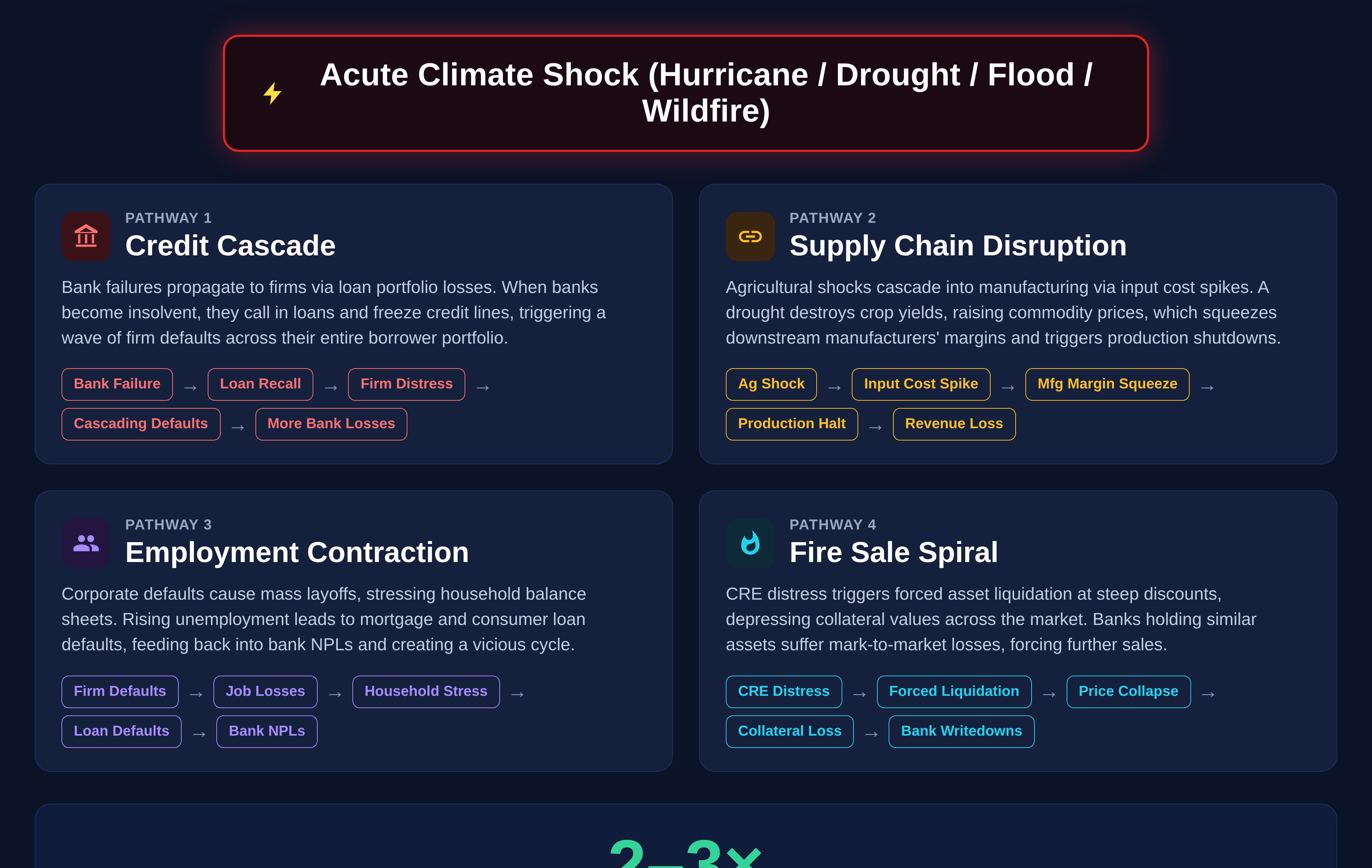 Infographic 1: The four contagion pathways that radiate from an acute climate shock — Credit Cascade, Supply Chain Disruption, Employment Contraction, and Fire Sale Spiral — each with its own trigger condition. When pathways activate simultaneously, combined losses amplify 2–3×.
The Monte Carlo approach captures irreducible uncertainty. Each of the 200 runs per scenario draws independently from Pareto-distributed shock severities, stochastic event timing, and endogenous bank capital dynamics. The result is a full probability distribution — not just a point estimate — that reveals the asymmetric, fat-tailed nature of climate-economic risk.
Architecture: The ABM Pipeline
The simulation runs as a 7-step pipeline from climate scenario selection through to the interactive output dashboard. The workflow below shows the full pipeline with INPUT/COMPUTE/OUTPUT stages and the model’s key parameters.
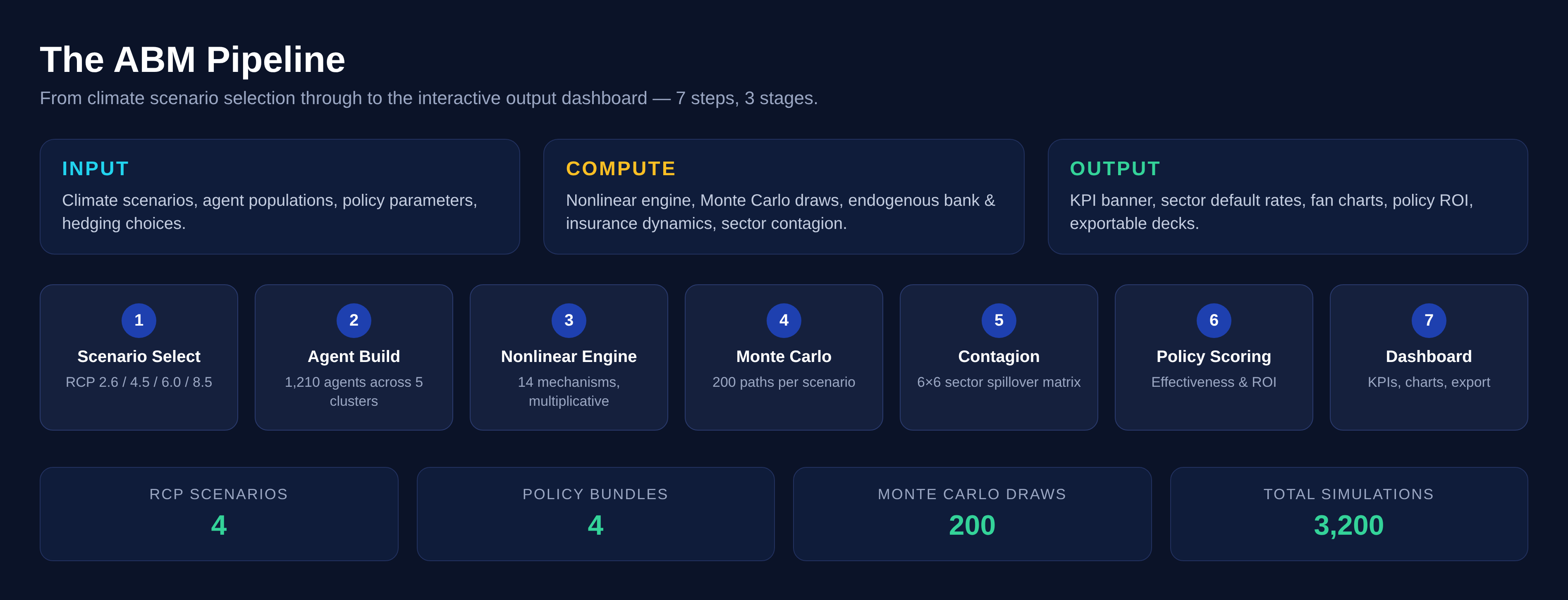 Infographic 2: The 7-step simulation pipeline from climate scenarios through the nonlinear engine, Monte Carlo, sector contagion, and policy scoring, out to the dashboard. 4 RCPs × 4 policy bundles × 200 Monte Carlo draws = 3,200 simulations.
Built on the Simudyne Platform. The ABM runs on Simudyne’s agent-based simulation engine, which handles agent lifecycle management, message-passing between agents, and parallel Monte Carlo execution. The platform provides the infrastructure for scaling from single-scenario runs to the full 4 RCP × 4 Policy × 200 MC = 3,200 simulation matrix.
1,210 heterogeneous agents across 5 clusters. The agent network comprises 10 banks (with loan portfolios and capital adequacy rules), 200 firms (across 6 sectors with different climate vulnerabilities), 1,000 households (with employment, income, and mortgage dynamics), an insurance market (with endogenous penetration and claims ratios), and a government agent (with carbon pricing, adaptation funding, and fiscal constraints). The diagram below shows how these agents connect.
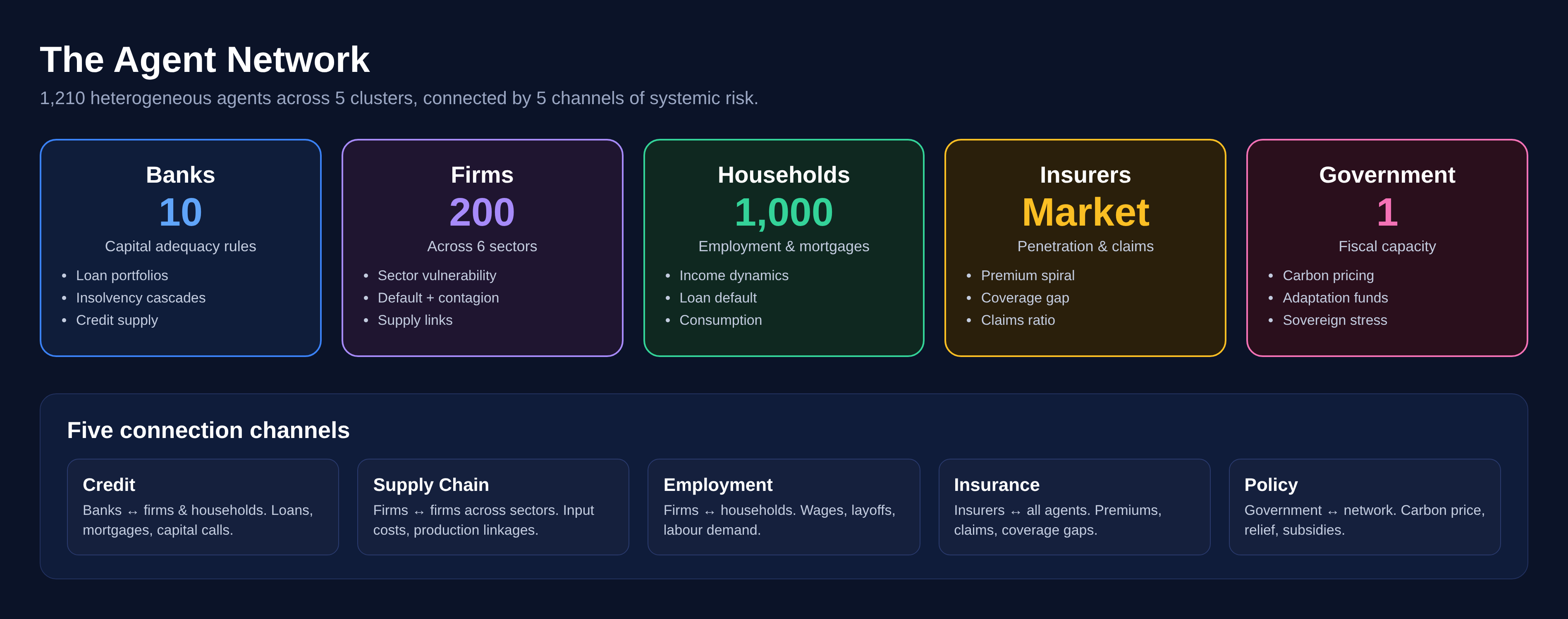 Infographic 3: The 1,210-agent network — 10 banks, 200 firms, 1,000 households, an insurance market, and a government — connected through credit, supply chain, employment, insurance, and policy channels.
Five connection channels create systemic risk. Credit links connect banks to firms and households (loans, mortgages). Supply chain links connect firms to firms across sectors. Employment links connect firms to households (wages, layoffs). Insurance links connect the market to all agents (premiums, claims). And policy links connect the government to the entire network (carbon pricing, relief). When any one agent fails, the shock propagates through these channels to its counterparties, potentially triggering secondary failures.
| Component | Count | Key Property | Failure Mode |
| Banks | 10 | Capital adequacy | Insolvency cascade |
| Firms | 200 | Sector vulnerability | Default + contagion |
| Households | 1,000 | Employment status | Loan default |
| Insurers | Market | Penetration rate | Death spiral |
| Government | 1 | Fiscal capacity | Sovereign stress |
The core of the Climate-Finance Agent-Based Model is a continuous simulation cycle known as the “Tick Loop,” which processes interactions through six sequential stages.
The cycle initiates with the Climate Pulse, where specific scenario data, such as warming levels and sea-level rise, are injected into the environment. For example, the model might apply a severe +3.7°C warming condition based on the worst-case RCP 8.5 scenario. Following this initial climate injection, the simulation moves into Fat-Tailed Shock Generation. During this phase, the system uses Pareto Type II (Lomax) distributions to introduce extreme, unpredictable “black swan” climate events into the simulation.
Once these shocks are introduced, the model performs a Tipping Point Check to determine if critical environmental thresholds have been breached. If warming exceeds specific limits—such as 1.5°C for Arctic ice loss or 3.0°C for AMOC weakening—these triggers add direct, compounding drags to the global GDP. The consequences of these climate events then ripple through the economy during the Sectoral Damage & Contagion phase. Utilizing a 6×6 Contagion Matrix, the model calculates how physical and financial damages originating in one sector propagate and impact others, demonstrating the interconnected vulnerability of the market.
This systemic stress directly feeds into the Financial Feedback Loop, where banks evaluate the newly elevated risk levels, causing insurance premiums to rise. The simulation reveals that if insurers adopt “optimistic” risk pricing models, it actually leads to systemic fragility and the creation of massive insurance coverage gaps. Finally, the loop concludes with Policy Mitigation. In this final step, interventions like carbon pricing and green infrastructure investments are applied to help stabilize the system, though the model strictly enforces the reality that these policy efforts yield diminishing returns over time.
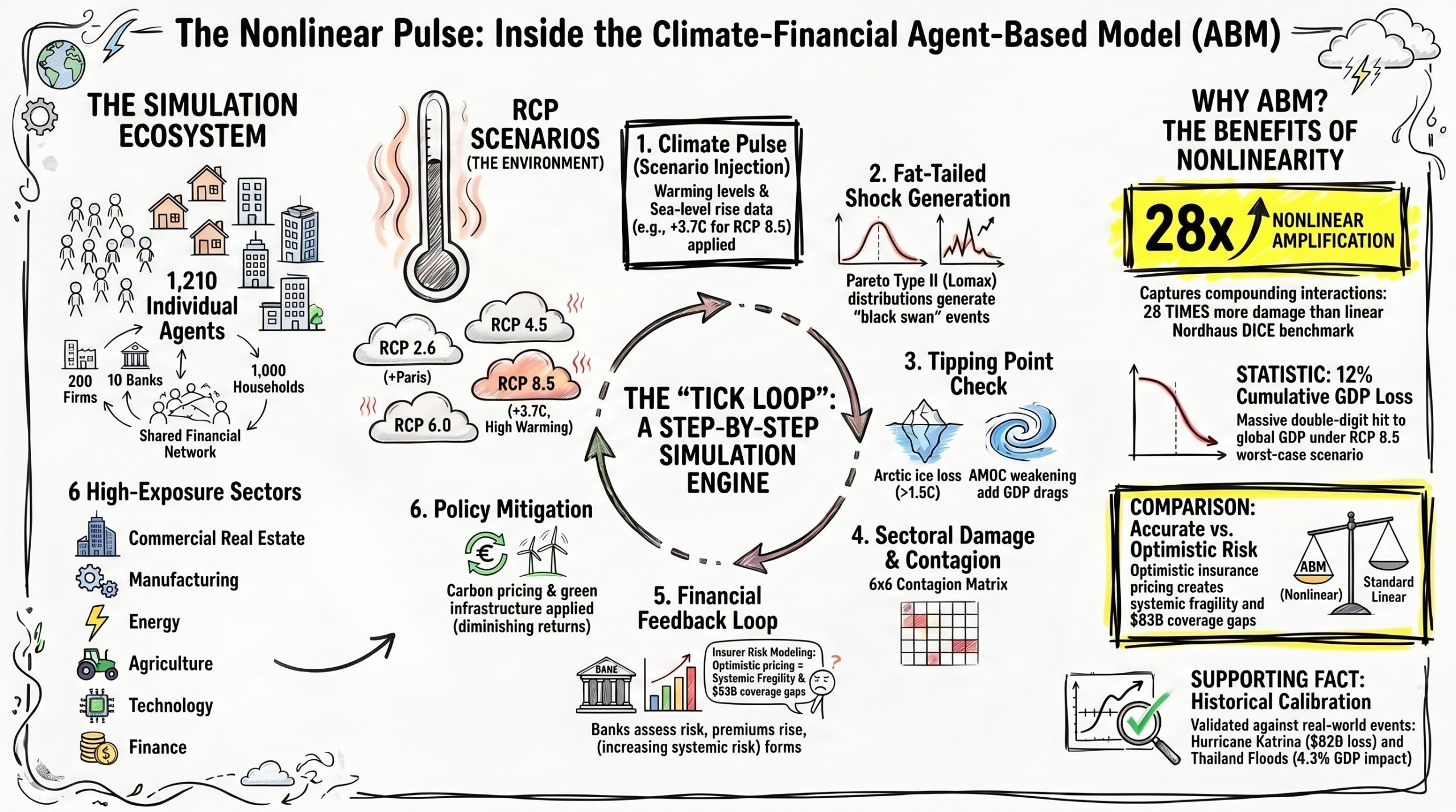 Infographic 4: The infographic visualizes the mechanics of the Climate-Financial Agent-Based Model (ABM), demonstrating how its six-step “Tick Loop” simulates compounding climate shocks across an ecosystem of interconnected economic agents to reveal 28 times more systemic damage than traditional linear models
The 28.5× Finding
Here’s the headline: RCP 8.5 warming is 3.7× that of RCP 2.6 (3.7°C vs 1.0°C). But in our nonlinear model, RCP 8.5 GDP loss is 28.5× larger — 12.3% vs 0.4%. The gap between what people intuitively expect and what the model produces is the core message. Humans are not good with exponentials. Linear models would predict roughly 3–4× amplification. The real answer, once you account for tipping points, contagion, and compound events, is nearly an order of magnitude higher.
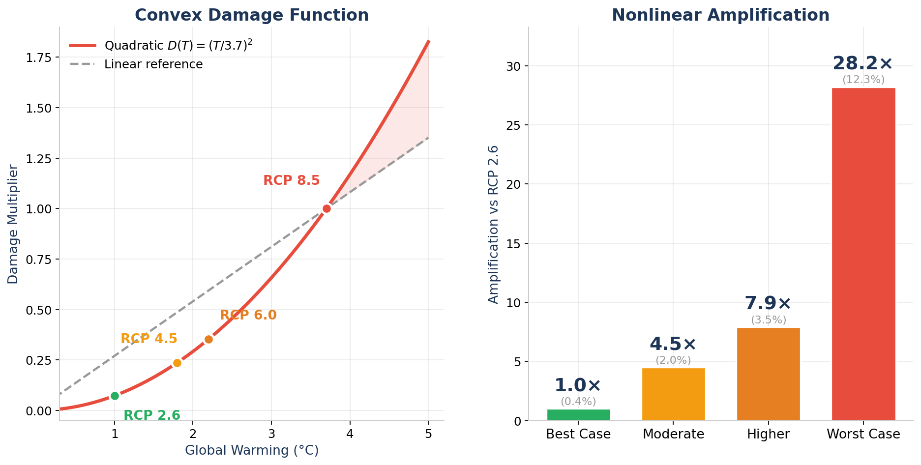 Figure 1: The convex damage function D(T) = (T/3.7)² (left) drives nonlinear amplification ratios (right) far exceeding the linear warming ratio.
The driver is mathematical: our damage function follows the Nordhaus DICE quadratic — D(T) = (T/3.7)². At 1.0°C warming, the damage multiplier is just 0.07. At 3.7°C, it’s 1.0 — a 14× ratio from the quadratic alone. But the other 13 nonlinearities amplify this further: tipping points add discrete jumps, Pareto fat tails generate outsized shocks, and cascade feedback loops make each shock hit harder than the last.
The Tipping Point Cliff
Climate tipping points are binary: they’re either off or on, and once crossed, they’re effectively irreversible on human timescales. Our model implements four thresholds from Lenton et al. (2008, 2019): Arctic ice loss at 1.5°C, coral reef collapse at 2.0°C, permafrost methane release at 2.5°C, and Atlantic Meridional Overturning Circulation (AMOC) weakening at 3.0°C.
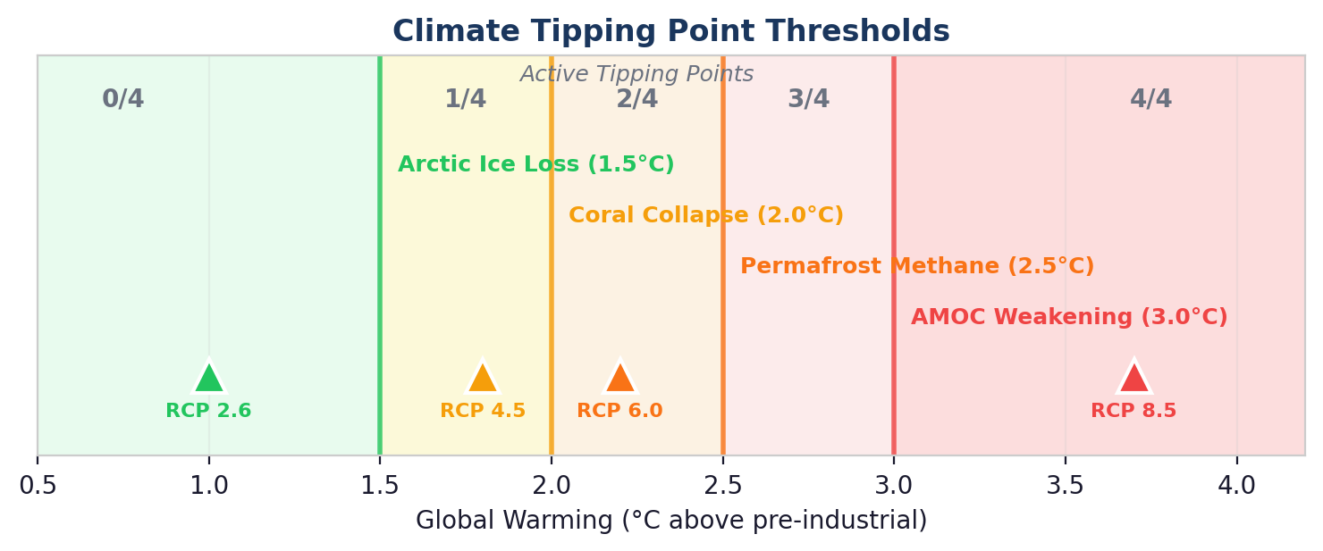 Figure 2: Climate tipping point thresholds. RCP 2.6 activates zero; RCP 8.5 triggers all four.
The distribution is catastrophically uneven. RCP 2.6 (1.0°C) sits safely below every threshold — zero tipping points active. RCP 4.5 (1.8°C) crosses one. RCP 6.0 (2.2°C) crosses two. And RCP 8.5 (3.7°C) triggers all four, unleashing compounding surcharges on chronic damage, acute event frequency, and sector-specific vulnerability. Each tipping point doesn’t just add risk — it multiplies the effectiveness of the others.
What 200 Monte Carlo Runs Tell Us
Uncertainty is not symmetric. We ran 200 Monte Carlo simulations for each scenario, sampling from Pareto-distributed fat-tailed shocks (α=2.5), stochastic event timing, and endogenous bank capital dynamics. The fan charts below tell a vivid story.
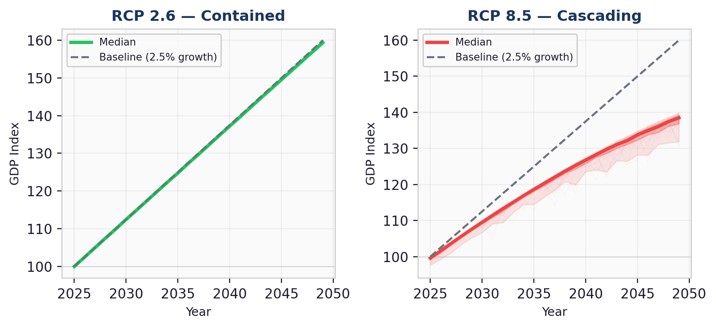 Figure 3: RCP 2.6 paths stay tightly clustered near baseline. RCP 8.5 paths explode into a wide, left-skewed fan after 2035.
RCP 2.6 is boring — and that’s the point. The paths cluster tightly around baseline growth. The P5–P95 spread at 2049 is just 1.1 GDP points. Climate risk under Paris-compliant warming is manageable.
RCP 8.5 is a different universe. The fan chart explodes after 2035 as compound event clustering (shock probability × (1 + 0.4t²)) accelerates late-period tail events. The P5–P95 spread reaches 8.0 GDP points. Critically, the fan is asymmetric — the P5 tail extends much further below the median than the P95 extends above it. This is the Pareto distribution at work: fat tails generate a small number of catastrophic runs that drag the left tail down sharply.
The Insurance Death Spiral
Insurance markets are a barometer of systemic stress. Under RCP 2.6, the insurance market functions normally: penetration holds at 59%, claims ratios stay at 0.09, and the coverage gap is a modest $4B. Under RCP 8.5, everything breaks.
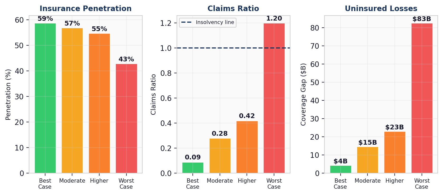 Figure 4: Insurance penetration collapses from 59% to 43%, claims ratio exceeds the insolvency line, and the coverage gap reaches $83B.
The death spiral mechanism: as climate severity rises, insurers face higher payouts. They raise premiums, which causes lower-risk participants to exit the pool (adverse selection). The remaining pool is riskier, so premiums rise further. Below 40% penetration, the model triggers an accelerated withdrawal loop — the coverage gap compounds at a rate proportional to (1 − penetration)². Under RCP 8.5, the claims ratio hits 1.2× (above the insolvency line), meaning insurers are paying out more than they collect. The $83B coverage gap represents uninsured climate losses that fall directly on governments, households, and bank balance sheets.
The Uncomfortable Truth About Policy
Policy works — but with diminishing returns. The Aggressive policy scenario ($150/ton carbon price, 3.5% GDP green infrastructure, 80% renewable subsidies) cuts RCP 8.5 GDP loss from 12.3% to 6.8% — a 45% reduction. That sounds impressive until you realize it’s still a 6.8% GDP loss, roughly equivalent to the 2008 financial crisis recurring every generation.
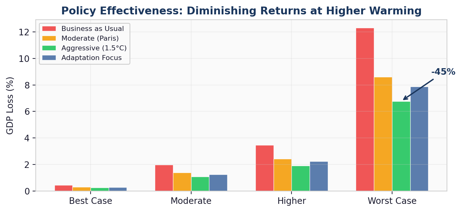 Figure 5: Policy effectiveness across RCP scenarios. Aggressive intervention cuts damage by 45% under RCP 8.5, but cannot overcome the nonlinear acceleration.
The exponential saturation is key: policy effectiveness follows 1 − e^(−x/scale). The first $50/ton of carbon pricing buys substantial reduction. The next $50 buys about half as much. The last $50 (from $100 to $150) buys even less. This is not an argument against ambitious policy — it’s an argument for early ambitious policy, before the nonlinear damage curve runs away from even the most aggressive intervention.
Two Different Kinds of Risk
The composition of climate risk changes with warming. At low warming (RCP 2.6), acute shock events account for 43% of total GDP loss — these are discrete storms, droughts, and floods that can be insured against. At high warming (RCP 8.5), chronic gradual degradation dominates at 60% of total loss — and chronic risk is essentially uninsurable.
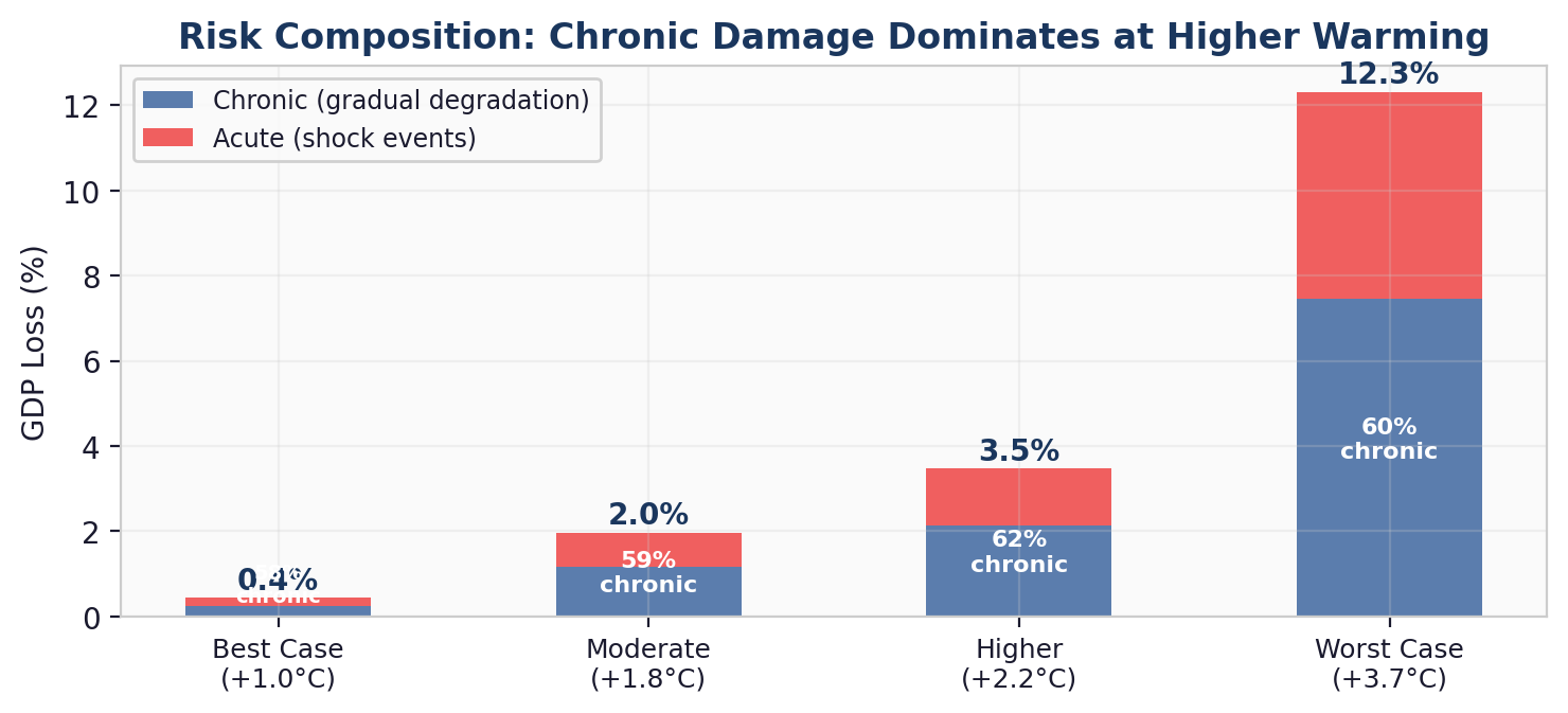 Figure 6: As warming increases, chronic damage overtakes acute shocks. This shift has profound implications for risk management strategy.
This crossover matters for risk managers. At low warming, traditional insurance and catastrophe bonds are effective hedges. At high warming, the dominant risk channel is the slow erosion of productivity, supply chains, and asset values — damage that accumulates year over year and cannot be transferred to insurers. The model’s chronic convexity amplifier (1 + 0.5×D(T)) captures this self-reinforcing dynamic: chronic damage at high temperatures makes the economy more fragile, which amplifies the next year’s chronic damage.
Where the Damage Concentrates
Not all sectors are created equal. Agriculture and Commercial Real Estate absorb the worst losses under RCP 8.5 (expected losses of 11.4% and 13.4% respectively), driven by direct physical exposure and cross-sector contagion. Technology is relatively insulated at 5.6%, but even this “safe” sector suffers losses that would be considered severe in any normal economic context.
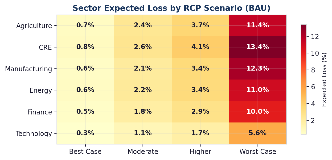 Figure 7: Sector expected loss heatmap. Agriculture and CRE exceed 13% under RCP 8.5; even Technology reaches 5.6%.
Cross-sector contagion amplifies the pain. The model’s 6×6 contagion matrix propagates stress between sectors: Agriculture stress spills to Manufacturing (weight 0.20) and Energy (0.10). CRE stress hits Finance (0.25). These inter-sectoral linkages mean that even sectors with low direct climate exposure accumulate losses through supply chain and financial network channels.
How to Use the Live Dashboard
Run your own scenarios in minutes. Every number in this post comes out of a dashboard you can drive yourself. Open climatefinanceabm.com and the full model — 1,210 agents, 14 nonlinear mechanisms, 200 Monte Carlo draws per run — is one click away. The interface is designed so a risk manager, loan officer, or regulator can reproduce the headline results and stress-test their own portfolios without writing any code.
 Dashboard home: KPI banner with global economic cost, sector vulnerability, and policy ROI sits above the banking-implications strip.
Step 1 — Pick a scenario template or build your own. The left panel includes three quick-start templates (Agricultural Lending Risk, With Adaptation Policies, Diversified Portfolio) that pre-load sensible defaults. For custom runs, adjust the agent population sliders (firms, banks, households), pick a climate pathway from the four RCPs (2.6 through 8.5), set the government relief threshold and bank risk appetite, and toggle the hedging strategies you want to evaluate.
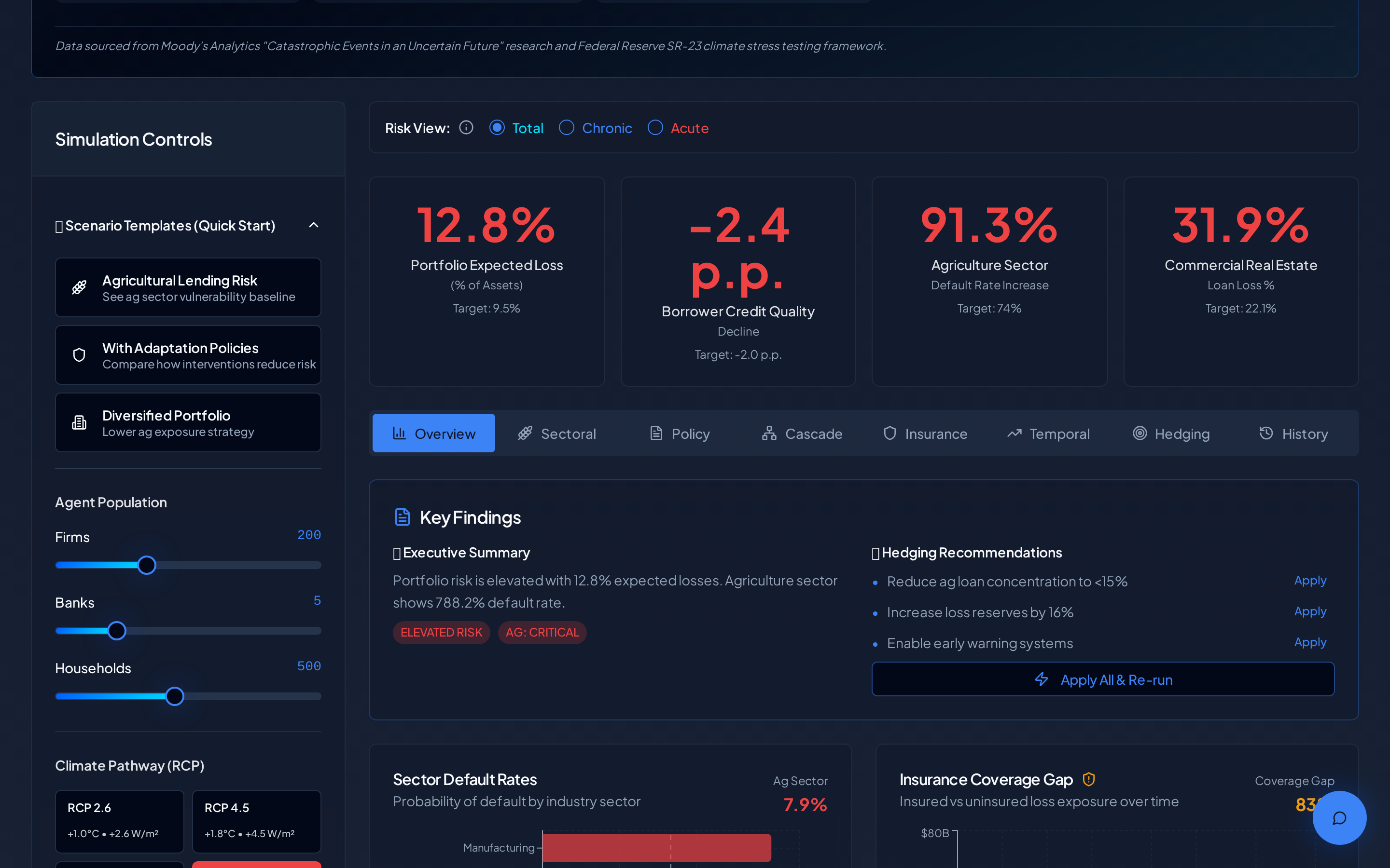 Left-panel controls and the post-run KPI strip: portfolio expected loss, borrower credit quality, agriculture sector default rate, and CRE loan loss. The “Run Simulation (2025–2050)” button triggers the full Monte Carlo batch.
Step 2 — Run the simulation. Click the blue “Run Simulation (2025–2050)” button. The status log streams progress messages while the engine initialises nonlinear dynamics and executes the 200-path Monte Carlo batch. When it finishes, four headline KPIs populate at the top — portfolio expected loss, borrower credit quality change, agriculture sector default rate, and commercial real estate loan loss — each compared against a risk target. Red numbers mean the run exceeded the target; green numbers mean the portfolio absorbed the shock.
Step 3 — Read the Key Findings and Hedging Recommendations. Immediately below the KPIs, the dashboard generates an executive summary in plain English (“Portfolio risk is elevated with 12.8% expected losses…”) and a ranked list of hedging actions — reduce agriculture concentration, raise loss reserves, enable an early warning system. Each action has an “Apply” link that writes the change back into the model so you can see the effect on the next run.
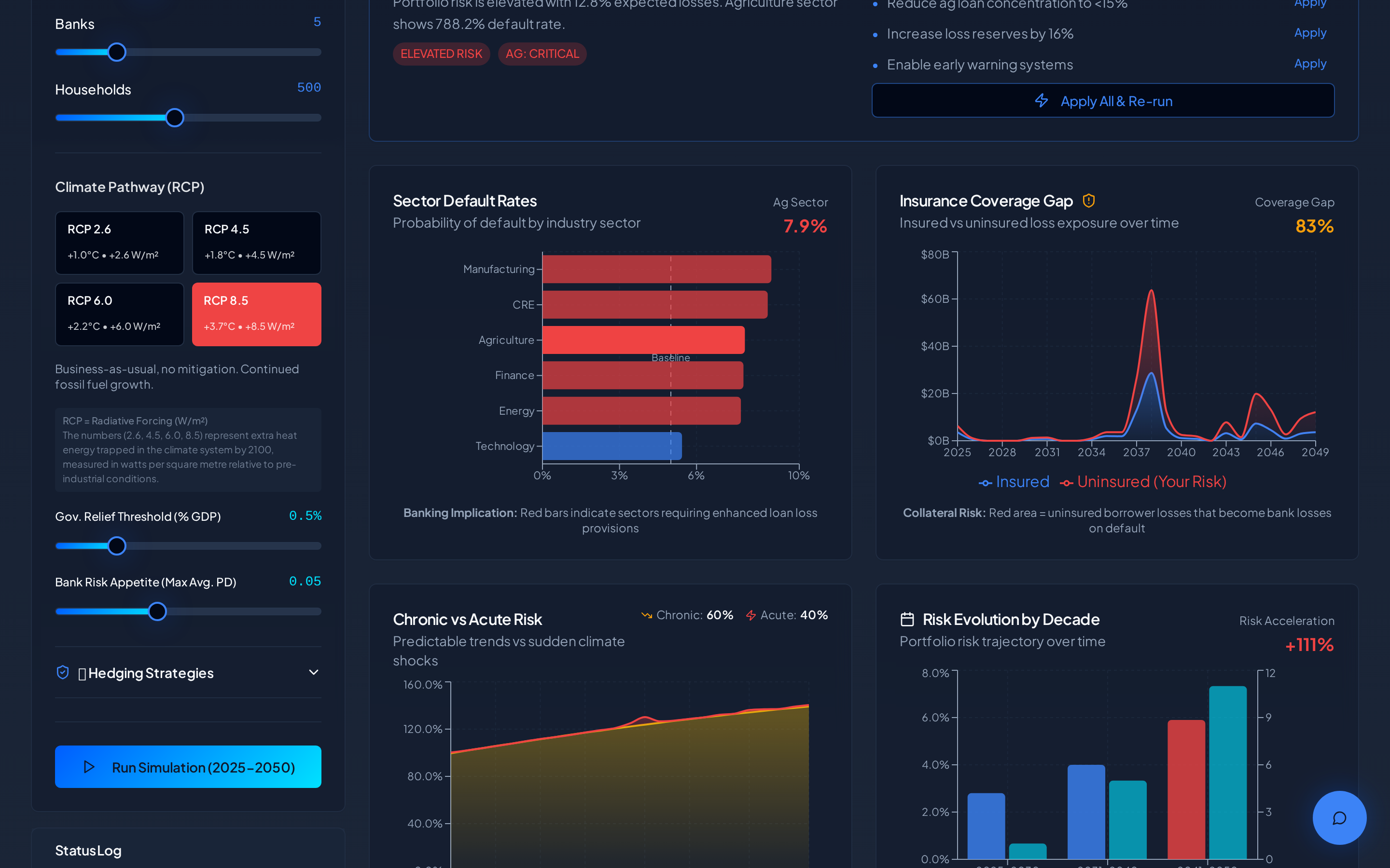 Analytical views: Sector Default Rates, Insurance Coverage Gap, Chronic vs Acute Risk trajectory, and the decade-by-decade Risk Evolution bar chart. Use the tabs to switch between Overview, Sectoral, Policy, Cascade, Insurance, Temporal, Hedging, and History.
Step 4 — Explore the analytical tabs. The tab strip under the KPIs opens eight analytical views. “Sectoral” shows per-sector default rates. “Policy” compares intervention bundles. “Cascade” traces how a shock moves through the 6×6 contagion matrix. “Insurance” surfaces the penetration collapse and coverage gap. “Temporal” unfolds the chronic-vs-acute crossover. “Hedging” benchmarks your hedging strategies against expected losses. “History” lets you compare prior runs side-by-side so you can attribute risk changes to specific parameter tweaks.
Step 5 — Export the results. The “Export PPT” button in the top-right packages the current view into a slide deck ready for a credit committee or risk meeting. All chart data is also available as CSV for downstream modelling.
Pricing and access. The dashboard is free to browse and free to view pre-loaded templates. Running a full custom simulation — the 200-path Monte Carlo across all mechanisms — is a paid action billed per run, which covers the cloud compute required. If you’d like volume pricing, model access for a team, or a bespoke scenario build, use the contact link in the footer.
The Bottom Line
Linear models create a false sense of security. When we ran the original version of this model with linearly-spaced RCP multipliers, the ratio between RCP 2.6 and RCP 8.5 GDP loss was 2.8×. With 14 nonlinear mechanisms, it’s 28.5×. That’s not a refinement — it’s a fundamentally different picture of climate-economic risk.
Three takeaways for decision-makers:
- Act early. Policy effectiveness follows exponential saturation. The same intervention buys dramatically more risk reduction at 1.5°C than at 3.7°C. Every year of delay moves you further up the convex damage curve, where each additional degree of warming costs more than the last.
- Think in tails, not averages. The Monte Carlo evidence shows that average outcomes systematically understate real risk under RCP 8.5. The P5 tail — the worst 5% of paths — shows GDP losses exceeding 16%. Risk management frameworks built on expected values are inadequate for a fat-tailed world.
- Watch the insurance market. Insurance penetration is the canary in the coal mine. When coverage withdrawal accelerates and claims ratios exceed 1.0, the system is entering a death spiral that concentrates losses on the least-prepared participants. Our model identifies this transition at roughly 2.5–3.0°C of warming — precisely where the tipping points cluster.
What’s next: We are extending the model to incorporate carbon-aware computing for simulation infrastructure, real-time satellite data feeds for calibrating event frequencies, and regional granularity (moving from global to country-level agents). The live dashboard already supports custom scenario exploration — run your own combinations and see how the nonlinearities interact.
Explore the live dashboard: Run your own scenarios at
🔗 Download the Whitepaper
Climate-Economic Contagion: An Agent-Based Model for Quantifying Systemic Financial Risk Under IPCC Climate Pathways
References
[1] Nordhaus, W. (2017). “Revisiting the Social Cost of Carbon.” Proceedings of the National Academy of Sciences, 114(7), 1518–1523.
[2] Keen, S. (2020). “The appallingly bad neoclassical economics of climate change.” Globalizations, 22(1), 1–29.
[3] Lenton, T. M. et al. (2008). “Tipping elements in the Earth’s climate system.” Proceedings of the National Academy of Sciences, 105(6), 1786–1793.
[4] Lenton, T. M. et al. (2019). “Climate tipping points — too risky to bet against.” Nature, 575, 592–595.
[5] Network for Greening the Financial System (NGFS). (2023). NGFS Climate Scenarios for Central Banks and Supervisors. Phase IV Technical Documentation.
[6] Centre for Economic Policy Research (CEPR). (2023). “Climate risk stress tests underestimate potential financial sector losses.” VoxEU Column. cepr.org/voxeu.
[7] Storm, S. et al. (2024). “Macroeconomic Modelling in the Anthropocene: Why the E-DSGE Framework is Not Fit for Purpose.” Institute for New Economic Thinking (INET) Working Paper No. 229.
[8] Grubb, M. et al. (2021). “Modeling myths: On DICE and dynamic realism in integrated assessment models.” WIREs Climate Change, 12(3), e698.
[9] Ortec Finance. (2024). “The Role of Damage Functions in Assessing Physical Climate Risks.” Ortec Finance Insights Blog.
[10] Grantham Research Institute, London School of Economics (LSE). (2018). “A Nobel Prize for the creator of an economic model that underestimates the risks of climate change.”
About the Author
Ilan Gleiser builds agent-based simulation models on the Simudyne platform, specializing in climate-financial risk, systemic contagion, and nonlinear economic dynamics.